|
Does your page feel a little stale? We’ve got some tips to help freshen up your Facebook.
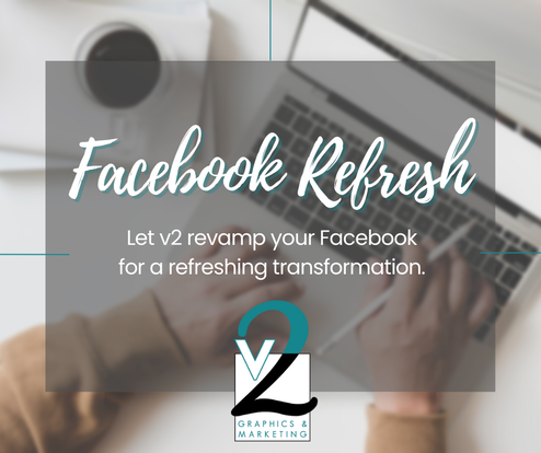
Your profile and cover photos are the first two things your audience sees when they visit your Facebook page. You want to make sure they create the best impression of your business. These two steps focus on your business profile picture and your cover photo. PROFILE PICTURE should be your business logo or a photo of the owner/team. If there is a way to do both in one picture - even better! This helps your audience identify your business visually within seconds. This also creates and builds brand awareness. COVER PHOTO is an extension of your profile picture and should be on brand with your marketing. Cover photos can highlight timely products or services or upcoming events and celebrations. Your cover photo could also highlight your staff and team members if your profile picture is your logo. Your cover photo should be changed a minimum of 4 times a year and as often as once a month. These two simple steps will make a difference in your page reach, your brand recognition and engagement with your followers. No reason to wait… head over to your Facebook page right now and make an update! Want to dig deeper with the v2 Team? Let us help you with a Facebook Refresh! We will audit your account and implement changes to assist with brand awareness, generate leads and grow your audience. The refresh includes a redesign of your profile and cover photos that will be consistent with your brand, a review of your business bio and about sections for greater reach and audience growth assessment.
0 Comments
I’ve been designing a TON of logos lately - shout-out to our local entrepreneurs! There is nothing more exciting for me than helping a budding business and watching their successes bloom. Not gonna lie, it’s also pretty cool to see stuff I’ve designed on printed materials, vehicles, buildings, billboards and clothing.
For logos, color plays an important part in conveying what a business is trying to say. Imagine the Walmart logo (the yellow star with blue letters) in lavender. It just doesn’t fit. But, why? Because purples represent luxury and royalty, while yellows conjure feelings of positivity and trust. It makes sense that Walmart wants you to walk in their door with a good attitude and trust in their company. Colors are specifically chosen for their impact on our psyche. Here are some examples: Red: Passion, love, excitement, youth, anger Examples: ESPN, Nintendo Blue: Calmness, tranquility, trust, reliability, stability, intelligence Examples: JP Morgan, Ford Yellow: Happiness, optimism, joy, positivity, energy. WARNING: Yellow can also represent caution or warning in certain contexts. Examples: Best Buy, McDonald’s Orange: Enthusiasm, creativity, warmth, vitality, and determination. It combines the energy of red and the cheerfulness of yellow. Examples: Nickelodeon, Harley Davidson Green: Nature, growth, harmony, freshness, balance, and renewal. It can also signify fertility and prosperity. Examples: Tropicana, Whole Foods, Holiday Inn Purple: Royalty, luxury, spirituality, mystery, creativity Examples: Hallmark, Syfy Channel Black: Power, elegance, formality, sophistication, and mystery. Examples: CBS, Apple Of course, all rules are meant to be broken and a logo using unexpected or memorable colors can sometimes stand out among competitors. Do you see how some of the businesses above use their logos to invoke specific emotions? It’s all by design. By Valerie Nunnenkamp |
We're v2.
Thanks for stopping by our blog! Archives
July 2024
Categories |


 RSS Feed